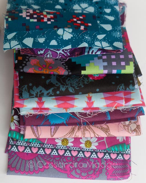
As part of my Finish-a-long post from last month, I included a quilt I had been planning and shopping for months. Using mainly Anna Maria Horner’s Pretty Potent line, and one of the patterns from Vintage Quilt Revival, this quilt has been almost a year in the making.
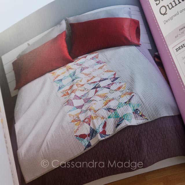
The quilt design I picked is called Star Bright, a take on the paper pieced Exploding Star block. Written and pieced in the book by Faith Jones of Fresh Lemon Quilts. Faith uses two shades of Putty solid on each side of the pieced stars, however I wasn’t taken with the colour and came across a beautiful homespun in a little haberdashery shop which I thought would look fabulous. The colour changes by light, but it’s more a shade of light caramel which works well with the yellow/wheaten tones in the prints.
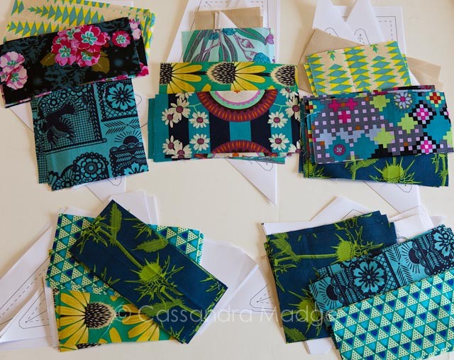
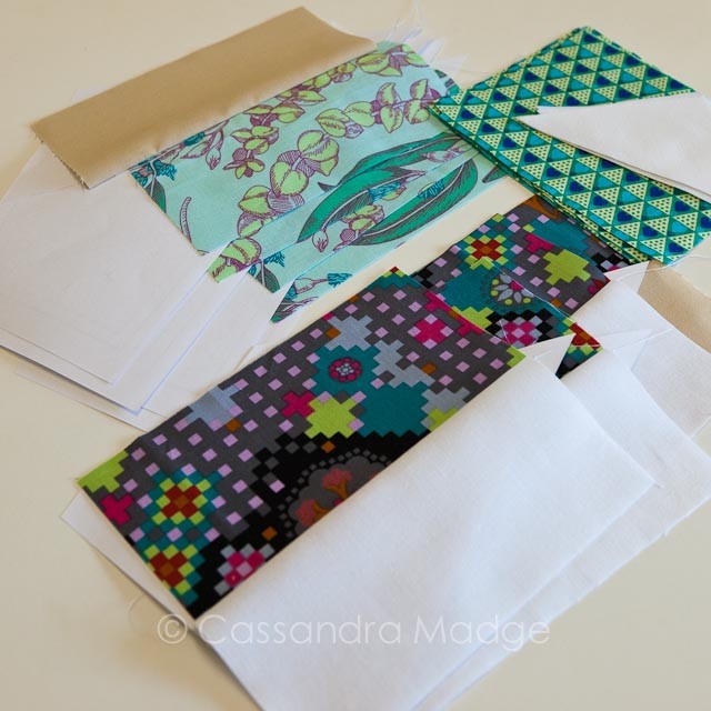
A feature of the book pattern that I didn’t appreciate as much when I reviewed it last year, is the cutting guide which allows you to cut everything for the blocks in one go. I did remeasure my templates and reduce most of the rectangle sizes by 1/2 an inch because I’m stingy and I hate waste. It worked quite nicely, although one particular piece is a little tight fitting and I have to pay attention when I’m piecing that one. But by spending a couple of evenings cutting everything in advance, yesterday I was able to sit down with my pile of cool coloured pieces, each prepped into groups, and start sewing. It was a bit of a marathon, but I knocked off 6 blocks by bedtime.

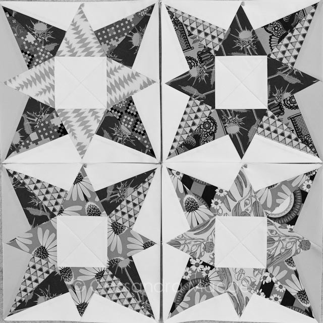
A tip I posted on Instagram, that I wanted to enlarge on a bit here, was the use of a simple black and white filter to check the “value” of your prints when you are choosing them for a block. How often have you put two prints together that, although different colours, seem to merge in a trick of the eye? That’s because there’s not enough contrast between them – usually in the area of value, which has to do with how light, dark, or in between they are. The same shot is reproduced above for you in black and white. You can see that the top right and bottom left blocks have distinct separation between each section. The three prints are easily identified as being light (the hearts), medium (the lace or the echinacea) and dark (the thistles). However in the other two blocks, top left and bottom right, the distinction, although present, isn’t quite as clear.
This is an important part of quilt colour theory that we all need to learn. It will mean less quilts that leave you frustrated, scratching your head and asking why it didn’t work the way you envisioned it, and more quilts that sparkle and literally stop you in your tracks.
And how do you learn it? You don’t need another fancy gadget or an art degree. All you need is something that we all carry around with us, without thinking. Our mobile phone! Snap a picture of your fabric selection, your block layout or a colour combination that inspires you. Go into your camera picture editor, and simply change the photo to black and white, just as I did here. Without the colour information, which can mislead us, the values remain clear. After a bit of practice, you will begin to notice value without needing to take a photo and start to realise when things are right, or need some tweaking.
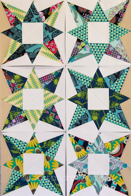
Here are the 6 “cool” colour blocks all finished. The pattern arrangement is such that they will have a lot of impact spread through the warm toned blocks. I’m so excited to see how this continues to shape up!
Some of my favourite individual blocks, due to that “sparkle” I mentioned above:
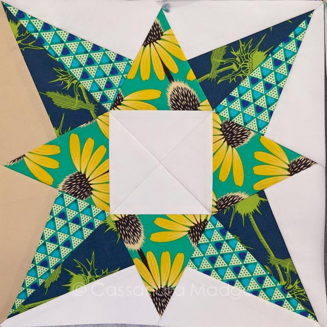
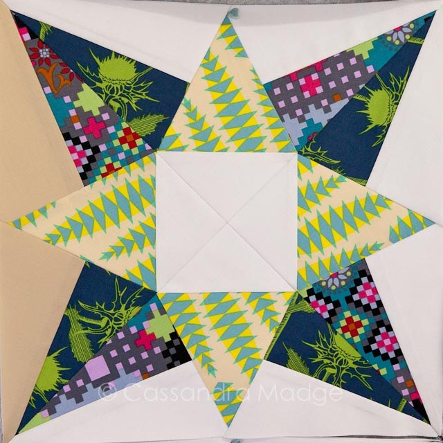
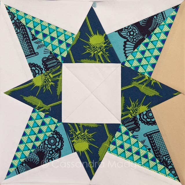
The paper-piecing allows you to make these blocks so neatly and accurately, and I’m very proud that I finally managed to “spin” the centre seams of the block to let them lay really flat. But I think that might be a post for another day.
Linking up with Lee at Freshly Pieced for WIP Wednesday.
So give it a try. When you are choosing colours for a quilt, or a block, snap a quick photo on your phone or tablet, then hop into your phone’s editor and add a black and white filter. I think that you might be surprised at what you find! Please if you try it, let me know how you go.

Please be aware that there may be affiliate links in this content. Your support allows me to keep creating for you!


Kate
Beautiful blocks!
Cassandra
Thankyou 🙂
Sandra
Spin the seams–oh yes! It really is a cool tip, used it first in one of Carrie Nelson’s Schnibbles quilt with lots of QSTs matching in centres… And the B&W tip is the best! I’ve written about that too. Also turning off the lights in your sewing room at night, leaving a hall light on and standing in the hall to take a look at your design wall, checking for value in this way too! LOVE your quilt so far. I have that book, and I totally hear you on the being stingy; the cost of fabric and to think randomly trimming off 1/2″ for each block section…it all adds up.
Cassandra
That’s a great tip Sandra, thanks so much for sharing it!
agnes
I do check my values often – especially with graphic heavy prints like those of AMH. And I agree – I don’t like trimming too much fabric off because of the waste. There are only so many 1/4″ hexies one can make. 😉
Cassandra
I haven’t been brave enough to try 1/4″ hexies yet. But I think they would use up the tiniest of scraps that I save lol.. 😉