Bonus points go to any of my fabulous blog readers who know where the name of this quilt comes from, double points to those who can work out why I named it so!
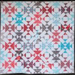
This quilt started as a dream back in 2016 – I reviewed the amazing book, One Wonderful Curve and put several quilts on my “Must make” list. Fist cab off the rank was the pattern Dragon Glass – using a fat quarter bundle and my Quick Curve Ruler. Curves do not scare me anymore – just watch the Quick Curve YouTube tutorial and give it a try!
Next came the fabric selection – I found a post I wrote in 2017 where I was giving you all some hints and tips on how to be more productive – I can tell you that I still follow them. Right then I showed this fabric, Joel Dewberry’s Heirloom line, and I had already planned out this quilt.

As you might notice if you know this quilt pattern already, I ditched the borders and made more blocks to increase the size. It’s so lush and dramatic with all the different colours – rich purples, golds, raspberry and lime. This quilt is a dramatic visual feast.
If you are making this quilt, for a fabulously flat and neat finished result, nest and spin your seams when at all possible. Don’t know what I mean? Check out this tutorial to help you! Spinning your seams reduces bulk and those annoying lumps where your seams all intersect. It simply takes a little bit of forethought and planning when you press your blocks. Also, as always with curves, starch your fabric before you cut!!
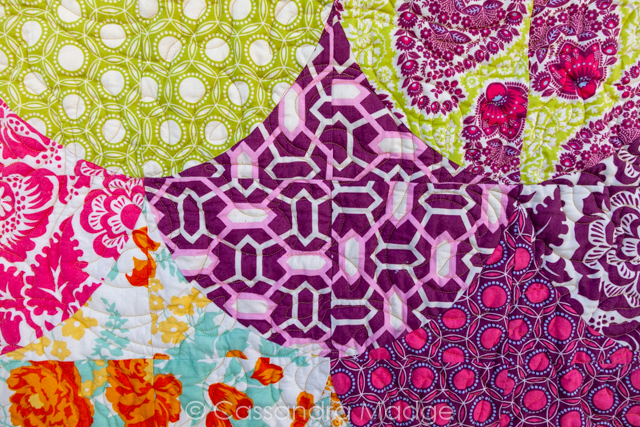
These colours – they really are that vivid!!
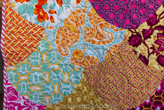
One thing that can be extremely challenging is choosing a quilting thread colour when a top has this much going on. If you simply quilted it in white thread, the stitching would be very obvious over all the dark fabrics in the blocks, however a dark purple or magenta thread would show up strongly over any of the lighter shades. After looking carefully and averaging out all the prints, I chose a straw gold So Fine thread, which blended magnificently with most of the blocks, and just left behind plenty of delicious texture.
When a quilt is this busy, with so much happening in terms of prints and colours, overdoing the quilting is like putting a massive statue on a gorgeous wedding cake. It stands out like a sore thumb and is overkill. All art and design is about balance, and for me, with a quilt top that shouts this loud? The quilting should be a supporting act, enhancing discreetly without being further in your face. You may have a different opinion, but that’s ok because it’s all art and beauty is always subjective!
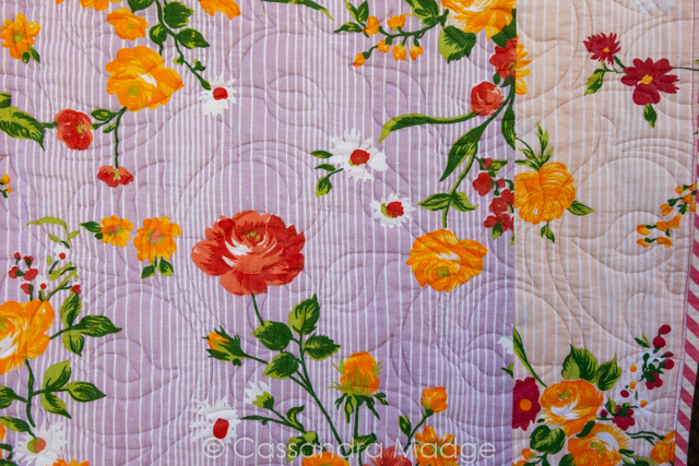
The backing was made of two vintage sheets – you can see the edge to edge quilting design better on the backing which is just a set of swirling vines and leaves. The reason why the quilting is so prominent with strong shadow lines is because I double batted this quilt. That meant two layers of batting which gives it a crazy amount of puff, the all important texture, and it’s a super cosy bed topper for the coldest nights.
It’s machine bound in a beautiful Raspberry bias stripe fabric, matching perfectly with the print colour. I machine bound it because the double batting made the binding edge very thick and I wanted to make sure that it could stand up to some hard use – this is a favourite on our bed already!
So, did you pick up on the clues? Do you know why I named it Erebor? Leave you answers in the comments, or email me if you have any questions, I love to hear from you.

Please be aware that there may be affiliate links in this content. Your support allows me to keep creating for you!
Leave a Reply